Weddingbells
Designed a responsive, accessible website for Weddingbells, strengthening brand cohesion, increasing load speed by 30%, and reducing publishing time by 35% through a modular responsive design system.
Year of completion
2020
In collaboration with
Nathan Foon, Developer
Year of completion
2020
In collaboration with
Nathan Foon, Developer
My role
Site Mapping
Website Audit
Landscape Analysis
Visual Design
UX/UI Design
QA Testing
View Site
Site Mapping
Website Audit
Landscape Analysis
Visual Design
UX/UI Design
QA Testing
View Site


The Ask
The Solution
- elevate the visual
aesthetic of the site and have
it be more reflective of the magazine
-
improve load times, site navigation and
overall performance
- increase user engagement
- provide the editors with more layout options to effectively curate articles and posts
- make it accessible from all devices
The Solution
- created a more succinct site map, navigation and clear IA
Site Map – Current & Proposed


- did a website audit of the original site to uncover problem areas
- conducted a landscape analysis to better understand the industry and see where we could improve their user experience and user engagement
Website Audit & Landscape Analysis


- sketched out some page layouts to surface high performance content and promote further reading
-
developed
a flexible modular system for editors to curate their articles
- drew on inspiration from the print layouts to develop a visual design system and pattern library
Pattern Library (View Full)

- created user interactions to enhance the reader experience
User Interactions
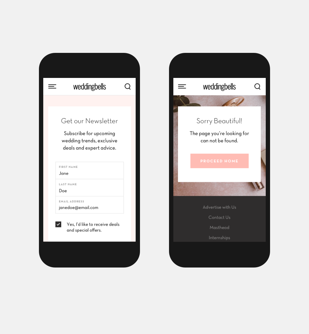
- designed a fully responsive website solution to ensure accessibility on desktop, tablet and mobile
- strengthened brand cohesion between the website and the magazine
- introduced a modular design system, giving editors greater layout flexibility and reducing publishing time by 35%
- improved overall site performance, including a 30% increase in load speed
- delivered a fully responsive, accessible experience across all devices
Desktop Layouts & Templates


Next ︎